/prod01/university-of-lincoln-cdn-pxl/media/responsive2017/abouttheuniversity/pressandmedia/Minerva,Building.jpg )
Press and Media
Press and Media Enquiries
The Press Office is the first point of contact for members of the press and media with editorial enquiries relating to the University of Lincoln. We are proud of our University community, and work with local, national, and international media to showcase the exciting research, developments, and achievements of our staff and students.
Alongside our latest press releases, you can find information on getting expert commentary for your stories or how to secure access to our campuses for filming, interviews, or photography.
Expert Comment
We have a wealth of academic expertise across the University ready to provide media comment and analysis across an extensive array of subject areas, from animal behaviour, to mental health.
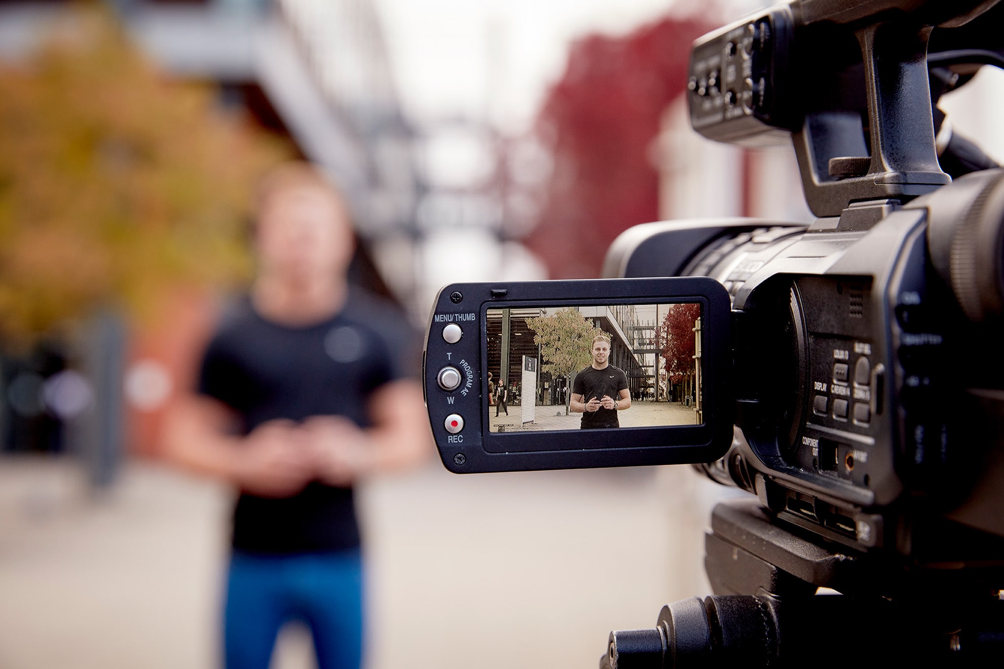
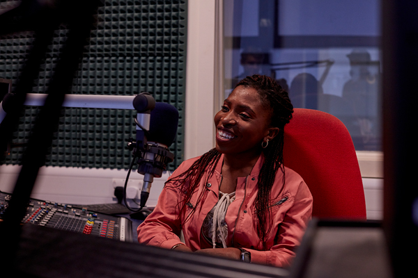
Media On Campus
If you are a media organisation wishing to conduct interviews, photography, or filming on one of our three inspiring campuses, please contact the Press Office in the first instance.
Logo Use and Brand Guidelines
To request use of the University's corporate logo or to request a copy of our brand guidelines, please email brand@lincoln.ac.uk. If you are a staff member, you can access our brand guidelines as well as range of helpful resources through the University's portal.
Latest News
Read about the latest exciting research, events, and success stories from across the University.
-
-
-
-